Baningo Cards
Early Dropout Reduction Through Preliminary Refinements
Implementing minor adjustments to address usability issues of a core product functionality.

Introduction
Baningo Cards is a web-based SaaS digital business cards solution, tailored for businesses and teams. It offers an platform to create, customise, and share digital business cards.
Baningo GmbH
March 2023 - May 2023
UX / UI Designer
Identifying issues
Defining solutions
Dev alignment & handoff
Performance tracking
Product Owner
Chief Technology Officer
Full-stack Developer
Back-end Developer
Front-end Developer
I joined the team as the first and only UX designer in an operational product environment. Before my involvement, the product had grown organically from idea to code.
During the initial in-depth product analysis, I observed notable usability issues with the card setup process. To address them effectively, significant adjustments to the product would be necessary. Given the need to balance design efforts with the demand for immediate development tasks, our approach prioritised fast-track solutions before considering more comprehensive changes.
Problem statement
The poor usability of the card setup process is a significant factor contributing to a high percentage of early user dropouts.
“How do I enter the details? How do I enter the phone number? I am confused.”
“It's more effort than I thought, so I haven't had the chance to finish it yet.”
Time-consuming micro-flows impact overall user productivity.
Card setup process at glance
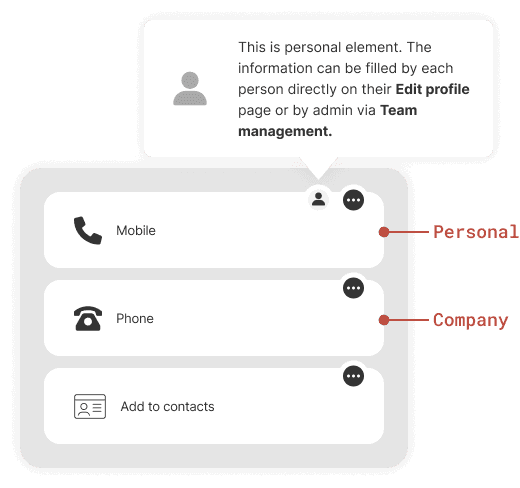
User roles define permissions and responsibilities assigned to users within the product.


Elements are the visual components used to display information on digital business cards.


Depending on the approach, cardholders can either fill in their own profiles, or the admin handles this task for all profiles within the team.

While acknowledging the overall process as the root cause of usability issues, the below fast-track improvements focused on optimising user experience without altering the process itself.
Product improvements
Element creation presented a significant hurdle in the card setup process, leading to user errors, confusion, and frustration.
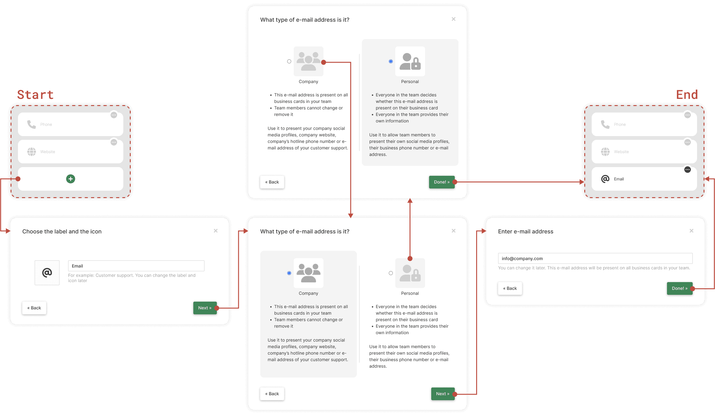
Consolidated steps in a single modal improve process visibility and help users retain context.
Reordered and numbered steps for a more intuitive sequence.
The new element highlights the inability to input personal element data within the modal and provides guidance.
Refined copy concisely explains the distinction between personal and company elements.
Before

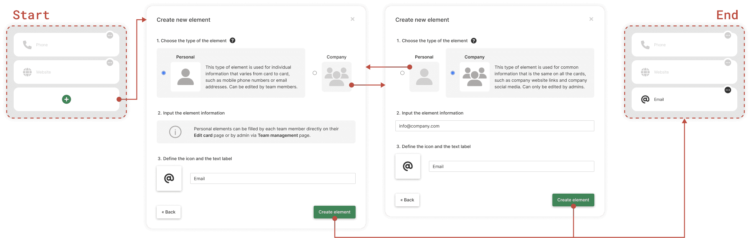
The lack of distinction between element types on the "Design and link" page resulted in a poor overview.
After

The indicator icon identifies personal elements, reducing cognitive load, and eliminating unnecessary clicks.
The tooltip additionally guides users where to input personal element data.
Before

Users had trouble finding where to upload logo and set the card colour.
After

The logo upload and the colour picker displayed prominently on the page ensure they are easily accessible.
Before


After

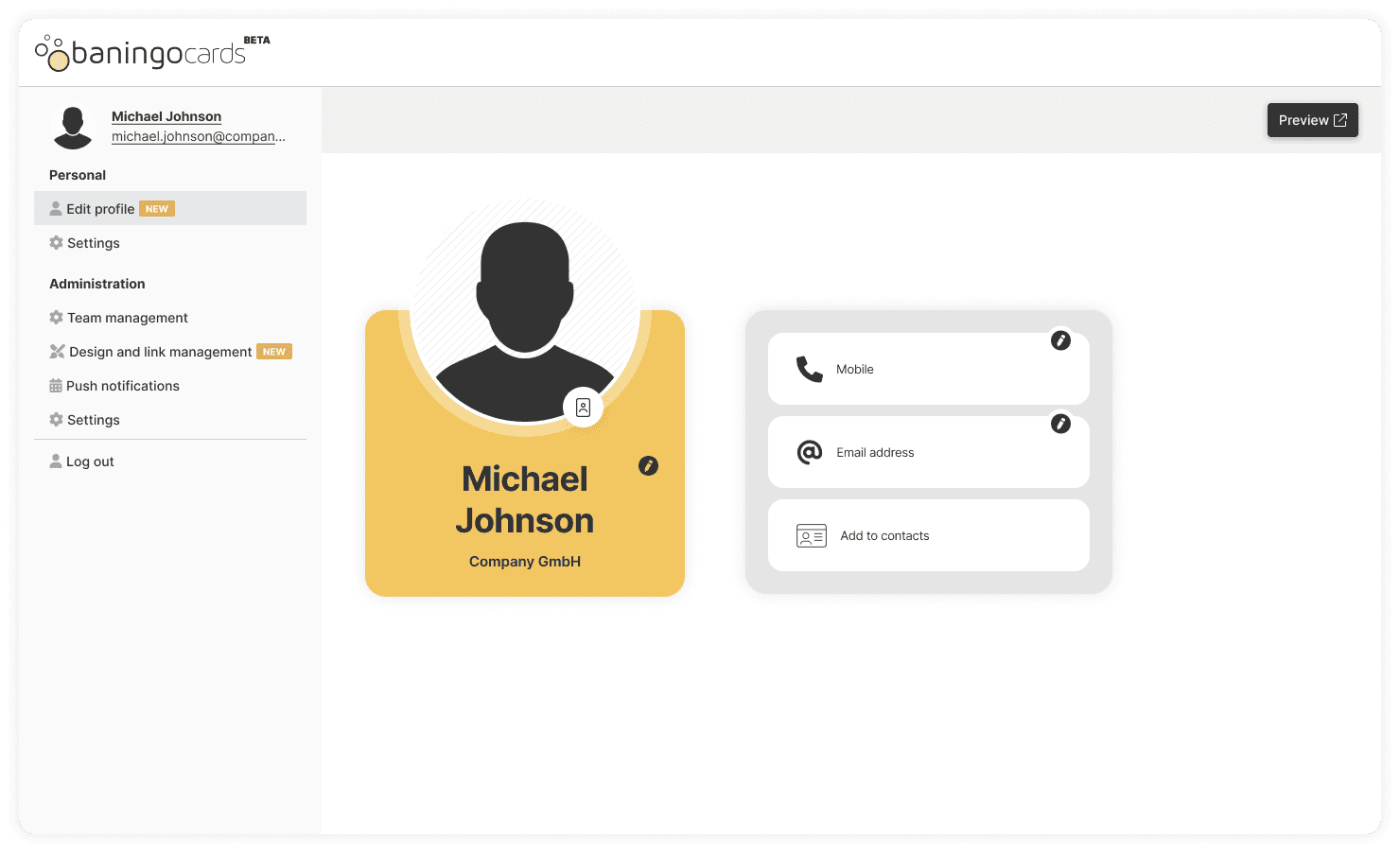
Displayed and clustered element data offer a comprehensive overview.
Simplified data input enhances efficiency.
The mobile preview provides real-time feedback in the most commonly used format.
The new page appearance ensures a clear distinction from the “Design and link” page.
Before
Upon skipping the onboarding admin users landed on their 'Edit Profile' page. They had difficulty locating options to add elements and change the card's appearance.
After
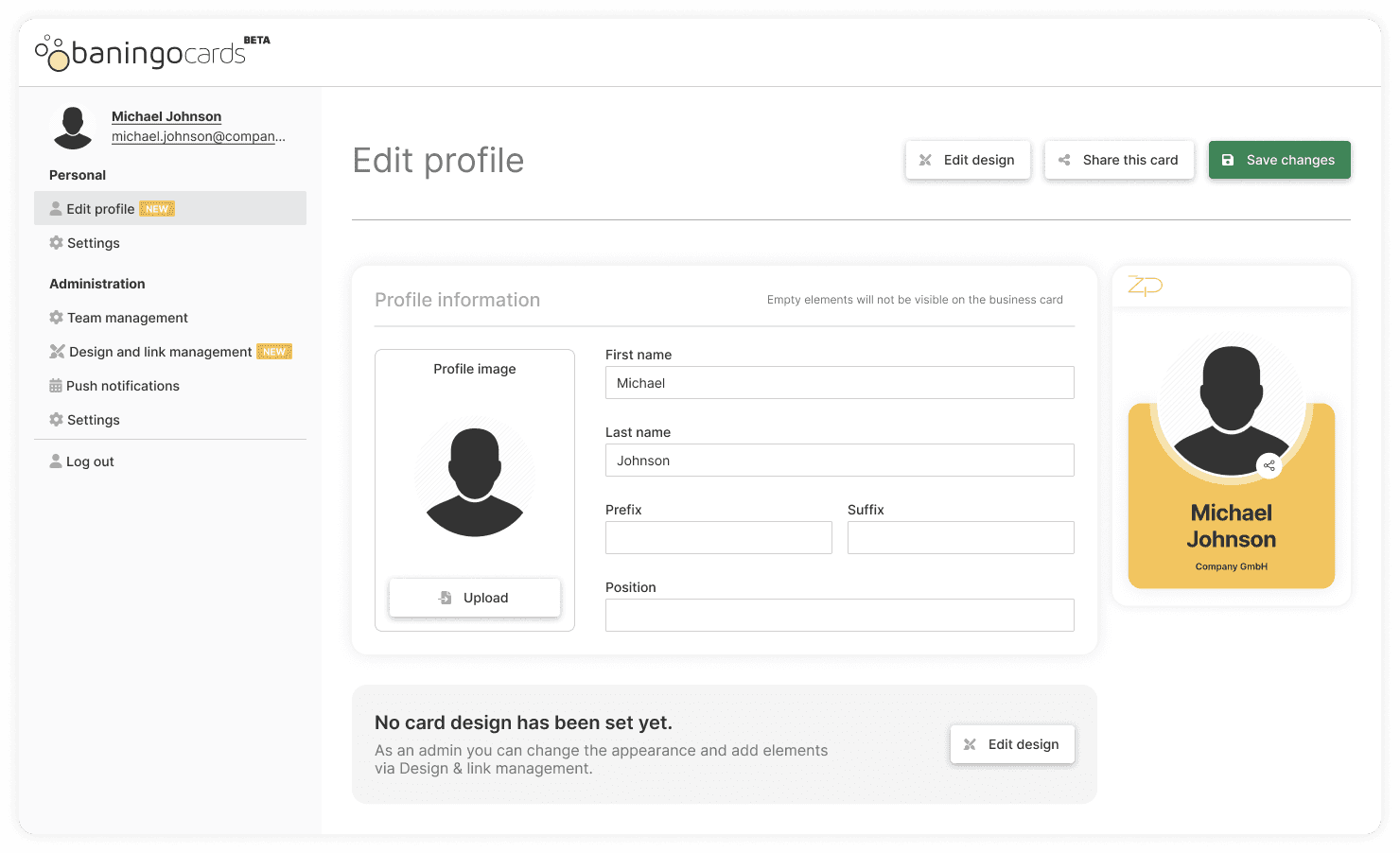
The new prompt directs admin users to the page where they can start their card setup process and helps them assume their admin role.
Enhancing the onboarding experience could address the issue more effectively, but the root problem lies in the fundamental approach to the card setup process. Therefore, allocating resources to improve onboarding would be premature without first addressing the underlying issues.
Before

The lack of basic functionalities made it difficult for admin users to manage a bigger number of profiles.
After

Search and sort functionalities for an efficient way to navigate and manage profiles.
The visually enhanced ellipsis button resolves the challenge of admin users locating profile actions.
Outcome
Evaluation
Given limited data and the product's nature, pinpointing the dropout rate precisely is challenging. The criterion was chosen based on its significance in product testing, correlating with early dropout. Despite potential discrepancies, the substantial percentage increase suggests the impact of usability improvements on reducing the dropout rate.
Words of endorsement
“Right from the start, Žiga showed a strong desire to understand our product and its users, using various approaches to gain insights. He effectively identified the major pain points and suggested both quick fixes and broader changes to address them. Even with only quick fixes in place, the improvement in usability was evident, leading to a significant reduction in early user dropout.”

Harald Meinl
Co-Founder & Product Owner @ Baningo GmbH
Next project

Web App
Page Redesign